Something that has often been neglected in recent weeks, in the communication of statistical information regarding the Covid-19 pandemic, is the reference of the data on the various aspects of the phenomenon (positive, deaths, recovered, hospitalized in intensive care, etc.) to the size of populations residing in the various regions of Italy. Absolute numbers have their own importance, especially those that refer to limited resources such as intensive care places, but risk not understanding the order of magnitude and the trends of the phenomena reported to the size of populations exposed to risk. It is quite clear, for example, that 100 deaths for Covid-19 do not have the same meaning in a region of ten million inhabitants (like Lombardy) and in one of three hundred thousand inhabitants (like Molise) ...
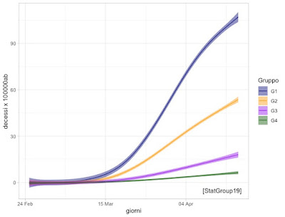
With this in mind for several days we have been reflecting on the various ideas moving around the web relating to the so-called "Phase 2". To date, we go from "better dead than poor" proposals to "better everyone picking berries". Given the centrality of the "mortality from Covid-19" aspect, we propose, in the graph below, the trend curves over time of the recorded deaths, relating to the resident population and therefore expressed as "deaths per 100,000 inhabitants". are obtained by means of semi-parametric models *. Using these models, we have been able to aggregate the twenty Italian regions into four "macro-groupings"**, both from the point of view of the order of magnitude of the phenomenon "deaths per Covid-19 per 100,000 inhabitants "and from the point of view of temporal dynamics. The graph shows" confidence bands "*** that allow us to say when two phenomena are really different or not.
It is clear from this graph that Covid-19 does not respect regional borders, but instead characterizes four large homogeneous areas in Italy, with four time trends and four different orders of magnitude. Similar trends in many cases are also observed for the other indicators (cases, occupation of intensive care units, etc.). It is our opinion that this diversity should also be reflected in the timing of the replacement of substantial isolation at home ("lockdown") with other measures of social distancing and prevention such as compliance with the minimum distance in closed places, the prohibition of gatherings, diagnostic tests at the first symptoms, electronic tracking, etc. (the so-called "Phase 2"). If the progressive, prudent reopening of production and social activities is to be decided on the basis of the possible impact that this reopening may have on the indicators (in particular, in this case, of mortality), the substantial diversity between regional macro-areas should be one of the guiding criteria.
*https://statgroup-19.blogspot.com/p/trends-in-crude-death-ratio.html
** regional macro-groups: G1 (we are going very badly) Lombardy and Valle d'Aosta, G2 (bad but recovering) Piedmont, Trentino Alto Adige, Emilia Romagna, Liguria, Marche; G3 (come on we can) Veneto, Abruzzo, Friuli Venezia Giulia, Tuscany; G4 (out of trouble) the rest of Italy.
*** the bands are constructed by adding and subtracting from the values of the curve 2 x standard error given by the model

Nessun commento:
Posta un commento