Post in evidenza

Covid-19 la nostra app è sempre attuale

  Con l'assidua collaborazione  Marco Mingione  e  Pierfrancesco Alaimo Di Loro  abbiamo creato uno strumento web interattivo che consen...

lunedì 27 aprile 2020

Percentages interpretation and the DPCM of 26 April 2020

Many things in Prime Minister Conte's press conference yesterday left us perplexed.

We just wanted to comment on a marginal point that seems to have gone unnoticed. Citing an ISS study, the premier said that one out of four infections occurs in the family. The ISS study is summarized in this link:

https://www.epicentro.iss.it/coronavirus/bollettino/Bollettino-sorveglianza-integrata-COVID-19_23-aprile-2020.pdf

and needless to say, it is well done.
Its interpretation, however, requires some more caution than that shown by some newspapers that have taken it up. The study reports that 44.1% of infections occurred in RSA, 24.7% in the family setting, 10.8% in hospital or day-hospital, and 4.2% at work. Of the remaining cases, for many, it was not possible to establish the context in which the infection occurred.

Does this mean that of all the infections, one in four is in the family? No.

There are two types of distortions that need to be considered. The first type is the sampling distortion. Several RSA monitoring campaigns have rightly been launched in various regions. If the positives are searched in RSA, it is normal that many of the positives found will be in RSA. Therefore, not only in reading these percentages is it possible to forget that they concern only those diagnosed, and not the entire population of patients who would be positive for the swab; but also the fact that the place of infection can be indicative of the probability of diagnosis. RSA patients are fragile, the more easily they will develop symptoms, and therefore the more easily they will be diagnosed. A diagnosis rightly leads to the monitoring of the entire structure, which does not happen (unfortunately) for many workplaces.
The second source of distortion is the missing information: for the reasons above, patients whose context is unknown are more likely to have had an infection at the workplace or in the supermarket than the RSA itself.

Another fundamental aspect is that the table is built on data collected only in April and therefore with the whole country in lockdown. In this case, the workplaces are not frequented at all and therefore cannot be places of contagion for many.

We conclude by asking once more that the individual data, in the availability of the ISS and the ASP, be shared with the researchers. In fact, it is possible to use appropriate statistical techniques that correct the percentages reported above for the distortion, giving more reliable estimates of the contagion contexts.

Interpretazioni delle percentuali e DPCM 26 aprile 2020

Molte cose nella conferenza stampa di ieri del premier Conte ci hanno lasciato perplessi.
Volevamo commentare solo un punto, marginale, che sembra sia passato inosservato. Citando uno studio ISS il premier ha dichiarato che un contagio su quattro avviene in ambito familiare. Lo studio ISS è riassunto in questo link:
e, non serve dirlo, è fatto bene.
La sua interpretazione però richiede qualche cautela in più di quella mostrata da alcune testate che lo hanno ripreso. Lo studio riporta che il 44,1% delle infezioni si è verificato in RSA, il 24,7% in ambito familiare, il 10,8% in ospedale o ambulatorio e il 4,2% al lavoro. Dei restanti casi, per molti non è stato possibile stabilire il contesto in cui è avvenuto il contagio.
Questo vuol dire che di tutti i contagi avvenuti, uno su quattro è in famiglia? No.
Ci sono due tipi di distorsioni che vanno considerate. Il primo tipo è una distorsione di campionamento. Sono giustamente state avviate diverse campagne di monitoraggio delle RSA in varie regioni. Se i positivi vengono cercati in RSA, è normale che molti dei positivi trovati saranno in RSA. Non solo quindi nel leggere queste percentuali si rischia di dimenticare che riguardano solo i diagnosticati, e non l'intera popolazione di pazienti che risulterebbero positivi al tampone; ma anche il fatto che il luogo di contagio può essere indicativo della probabilità di diagnosi. I pazienti in RSA sono fragili, più facilmente daranno sintomi, e quindi più facilmente saranno diagnosticati. Una diagnosi giustamente porta al monitoraggio dell'intera struttura, cosa che non accade (purtroppo) per molti luoghi di lavoro.
La seconda fonte di distorsione è il dato mancante informativo: per le ragioni sopra, i pazienti di cui non si conosce il contesto più probabilmente avranno avuto un contagio sul luogo di lavoro o al supermercato, rispetto alla RSA stessa.
Altro aspetto fondamentale è che la tabella è costruita su dati rilevati solo ad Aprile e quindi con l'intero paese in lockdown. In questo caso i luoghi di lavoro sono poco o per nulla frequentati e quindi non possono essere luoghi di contagio per molti.
Concludiamo chiedendo una volta di più che i dati individuali, nella disponibilità dell'ISS e delle ASP, vengano condivisi coi ricercatori. E' possibile infatti utilizzare tecniche statistiche appropriate che correggano le percentuali riportate sopra per la distorsione, dando stime più attendibili dei contesti di contagio.

mercoledì 22 aprile 2020

Our Covid-19 App

With the intense and continuous collaboration of Marco Mingione and Pierfrancesco Alaimo Di Loro we created an interactive web-tool that allows the visualization and processing of data with the models that we developed in recent weeks. The app automatically updates the data every day and shows a series of descriptive and model-based analyzes, with the possibility for the user to customize some choices.

It is a work in progress and much has to be done (the English section is on its way), but yet we want to start sharing it and have your feedback.

Are you curious to know what is happening in a given region? 
Is it true that the situation is improving? Go to the link


select the indicator of your interest,  choose if you want to look at absolute values ​​or variations, and the region for which you want information. You will get a description of the epidemic, through different graphs that will allow you to get an idea of what is going on.

Are you not satisfied with just a description of the situation to date? Are you curious about what will happen tomorrow?

The "Model" tab allows you to view some estimates and forecasts, as well as the performance of each indicator.

This is the part that still needs substantial work on our part at the moment. It should be speeded up (very little is missing) and completed with some other processing. Always remember that there is uncertainty in the forecast! Soon we will show the prediction intervals to underline and quantify estimates properly.


Finally, in the "Intensive care forecast" tab, the forecasts for the use of intensive care, by region, are shown and it is possible to view the statistics on the goodness of the predictions for the previous days.

Everyone's suggestions and advice are welcome.

La nostra Covid19-app


Con l'assidua collaborazione Marco Mingione e Pierfrancesco Alaimo Di Loro abbiamo creato uno strumento web interattivo che consente la visualizzazione e l'elaborazione dei dati con i modelli che abbiamo sviluppato in queste settimane. La app aggiorna in automatico i dati ogni giorno, e mostra una serie di analisi descrittive e basate su modelli, con la possibilità per l'utente di personalizzare alcune scelte.
Ancora molto è da fare, ma volevamo comunque iniziare a condividerla.
Siete curiosi di sapere cosa sta accadendo nella vostra Regione? Volete farvi un'idea confrontando i dati di diverse Regioni? E' vero che la situazione migliora? Andate al link
selezionate l'indicatore che vi interessa, se volete guardare i valori assoluti o le variazioni, e la regione per cui volete le informazioni. Avrete una descrizione dell'epidemia, attraverso diversi grafici che consentiranno di farvi un'idea.
Non vi accontentate solo di avere una descrizione della situazione ad oggi? Siete curiosi di conoscere cosa accadrà domani?
La scheda "Modello" vi consente di visualizzare, oltre che l'andamento di ciascun indicatore, alcune stime e previsioni.
Questa è la parte che al momento necessita ancora di lavoro sostanziale da parte nostra. Va velocizzata (manca pochissimo) e completata con qualche altra elaborazione. Ricordate sempre che c'è incertezza nelle previsioni! Presto mostreremo gli intervalli di previsione per sottolinearlo e quantificarlo bene.

Infine, nella scheda "Previsione terapie intensive" vengono mostrate le previsioni per l'occupazione delle terapie intensive, per regione, ed è possibile visualizzare le statistiche sulla bontà delle previsioni per i giorni precedenti.
Sono graditi suggerimenti e consigli da parte di tutti.

sabato 18 aprile 2020

Trends, death rate and regions

Something that has often been neglected in recent weeks, in the communication of statistical information regarding the Covid-19 pandemic, is the reference of the data on the various aspects of the phenomenon (positive, deaths, recovered, hospitalized in intensive care, etc.) to the size of populations residing in the various regions of Italy. Absolute numbers have their own importance, especially those that refer to limited resources such as intensive care places, but risk not understanding the order of magnitude and the trends of the phenomena reported to the size of populations exposed to risk. It is quite clear, for example, that 100 deaths for Covid-19 do not have the same meaning in a region of ten million inhabitants (like Lombardy) and in one of three hundred thousand inhabitants (like Molise) ...

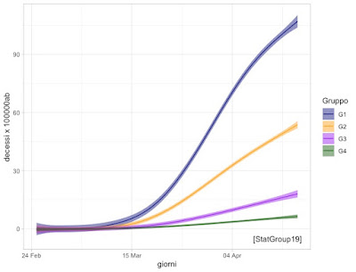
With this in mind for several days we have been reflecting on the various ideas moving around the web relating to the so-called "Phase 2". To date, we go from "better dead than poor" proposals to "better everyone picking berries". Given the centrality of the "mortality from Covid-19" aspect, we propose, in the graph below, the trend curves over time of the recorded deaths, relating to the resident population and therefore expressed as "deaths per 100,000 inhabitants". are obtained by means of semi-parametric models *. Using these models, we have been able to aggregate the twenty Italian regions into four "macro-groupings"**, both from the point of view of the order of magnitude of the phenomenon "deaths per Covid-19 per 100,000 inhabitants "and from the point of view of temporal dynamics. The graph shows" confidence bands "*** that allow us to say when two phenomena are really different or not.

It is clear from this graph that Covid-19 does not respect regional borders, but instead characterizes four large homogeneous areas in Italy, with four time trends and four different orders of magnitude. Similar trends in many cases are also observed for the other indicators (cases, occupation of intensive care units, etc.). It is our opinion that this diversity should also be reflected in the timing of the replacement of substantial isolation at home ("lockdown") with other measures of social distancing and prevention such as compliance with the minimum distance in closed places, the prohibition of gatherings, diagnostic tests at the first symptoms, electronic tracking, etc. (the so-called "Phase 2"). If the progressive, prudent reopening of production and social activities is to be decided on the basis of the possible impact that this reopening may have on the indicators (in particular, in this case, of mortality), the substantial diversity between regional macro-areas should be one of the guiding criteria.


*https://statgroup-19.blogspot.com/p/trends-in-crude-death-ratio.html
** regional macro-groups: G1 (we are going very badly) Lombardy and Valle d'Aosta, G2 (bad but recovering) Piedmont, Trentino Alto Adige, Emilia Romagna, Liguria, Marche; G3 (come on we can) Veneto, Abruzzo, Friuli Venezia Giulia, Tuscany; G4 (out of trouble) the rest of Italy.
*** the bands are constructed by adding and subtracting from the values ​​of the curve 2 x standard error given by the model

Trend, tasso di mortalità grezzo e regioni

Un aspetto che è stato spesso trascurato in queste settimane, nella comunicazione di informazioni statistiche riguardanti la pandemia da Covid-19, è il riferimento dei dati sui vari aspetti del fenomeno (positivi, decessi, guariti, ricoverati in terapia intensiva, ecc.) alla dimensione delle popolazioni residenti nelle varie regioni d’Italia. I numeri assoluti hanno una loro importanza, soprattutto quelli che fanno riferimento a risorse limitate come i posti di terapia intensiva, ma rischiano di non far capire l’ordine di grandezza e gli andamenti dei fenomeni riportati alle dimensioni delle popolazioni esposte al rischio. E’ del tutto evidente, per fare un esempio, che 100 decessi per Covid-19 non hanno lo stesso significato in una regione di dieci milioni di abitanti (come la Lombardia) ed in una di trecentomila abitanti (come il Molise)…
Con questo in mente sono parecchi giorni che riflettiamo sulle varie idee in circolazione relative alla cosiddetta “Fase 2”. Ad oggi andiamo da proposte del tipo “meglio morti che poveri” a “meglio tutti a raccogliere bacche”. Data la centralità dell’aspetto “mortalità da Covid-19", vi proponiamo, nel grafico riportato qui sotto, le curve di andamento nel tempo dei decessi registrati, relativizzati alla popolazione residente ed espressi quindi come “decessi per 100000 abitanti”. Le curve sono ottenute mediante modelli semi-parametrici *. Utilizzando questi modelli, abbiamo potuto aggregare le venti regioni italiane in quattro “macro-raggruppamenti”**, sia dal punto di vista dell’ordine di grandezza del fenomeno “decessi per Covid-19 per 100000 abitanti” sia dal punto di vista della dinamica temporale. Nel grafico riportiamo delle "bande di confidenza"*** che ci permettono di dire quando due fenomeni sono davvero diversi o meno.
E’ chiaro da questo grafico che il Covid-19 non rispetta i confini regionali, ma caratterizza invece quattro grandi aree omogenee in Italia, con quattro andamenti temporali e quattro ordini di grandezza diversi. Simili andamenti in molti casi si osservano anche per gli altri indicatori (casi, occupazione posti di terapia intensiva, ecc.). E’ nostra opinione che questa diversità dovrebbe riflettersi anche nella tempistica della sostituzione del sostanziale isolamento a casa (“lockdown”) con altre misure di distanziamento sociale e prevenzione quali il rispetto della distanza minima nei luoghi chiusi, il divieto di assembramenti, i test diagnostici ai primi sintomi, il tracciamento elettronico, ecc. (la cosiddetta “Fase 2”). Se si deve decidere la progressiva, prudente riapertura delle attività produttive e sociali in base al possibile impatto che tale riapertura può avere sugli indicatori (in particolare, in questo caso, di mortalità), la diversità sostanziale fra macro-aree regionali dovrebbe essere uno dei criteri guida.

**macro-raggruppamenti regionali: G1 (andiamo molto male) Lombardia e Valle d’Aosta, G2 (male ma in ripresa) Piemonte, Trentino Alto Adige, Emilia Romagna, Liguria, Marche; G3 (dai che ce la facciamo) Veneto, Abruzzo, Friuli Venezia Giulia, Toscana; G4 (fuori dai guai) il resto d’Italia.
***le bande sono costruite sommando e sottraendo ai valori della curva 2 x errore standard dato dal modello

venerdì 17 aprile 2020

Hospitalization and Intensive care

In the last 2-3 weeks, a significant improvement has been observed in the ratio between the number of people hospitalized with mild symptoms (R) and the number of people in intensive care (TI). Today, for every person in ICU there are about 9 people with mild hospitalizations, this ratio was just above 6 during the critical phase. This trend could suggest the hypothesis that today the health level of the identified cases may be of less criticality than that of the cases identified in the peak phase.


Ricoveri con sintomi lievi e ricoveri gravi

Nelle ultime 2-3 settimane si è osservato in Italia un miglioramento rilevante nel rapporto fra il numero di persone ricoverate in altri reparti (R) ed il numero di persone in terapia intensiva (TI). Oggi, per ogni persona in terapia intensiva ci sono circa 9 persone con ricoveri lievi, tale rapporto era poco più di 6 durante la fase critica. Questo andamento potrebbe suggerire l’ipotesi che oggi il livello di gravità clinica dei casi identificati sia meno critico rispetto a quello dei casi identificati nella fase di picco.


domenica 12 aprile 2020

So many words

StatGroup-19 was born on March 3, with Fabio's call to arms.
We could not stand still in the face of the starting epidemic, miraculous models that claimed to save Italy from Covid-19 (it seemed like a TV sale: "and with the model I also give you two pots and three pans!") and people's real need to understand what's going on.
On our side we have that we made our work  out of the  passion of a lifetime.
Navigate the stream of data, sometimes not clean data,
that are made public every day has been our job for years. Our motto is "get your hands dirty instead of watching".

Our common work is a continuous flow of thoughts, sometimes disconnected, often at 6 in the morning or at 2 in the morning (insomnia is one of the common denominators that keep us together). Everything takes place in a chaotic Facebook chat, tucked into our already chaotic daily life made up of the usual workload, including teaching and research. We asked ourselves then: what did  we say these days?


Below you can see a wordcloud of the most frequently used words in these forty days.
Yesterday there were 26116 messages and 138245 words, with which we understood a little
more of the covid-19 pandemic, we gave ourselves some answers, we shared our code with colleagues from ours and from other countries, and above all, we hope to have helped someone to rationalize and to be less afraid. Close to typical words of our discipline (data, model, poisson, exponential ..) emerges the urgency, the need to quickly understand, launch hypotheses, conjectures, and doubts and continually verify them on the data (credo, forse, sembra, capire, fare...- I think, perhaps, it seems, understand, do ...), the words today (oggi), do (fare), done (fatto9, so frequent indicate concreteness and work in real-time.


A childhood friend of one of us, a few weeks ago, wrote: "I don't understand what those red dots are that you put in the graphs, but they give me some hope. " This made worth having written all those words in chat.
Yes, people different from us, the ones who fight with numbers since the first grade, are the reason that pushes us even today to do something, in our small way: the sister disheartened for having received WhatsApp messages that foresee the apocalypse; the physician friend who sees new sick people every day and asks you "when will it end?"; the ex-student or the old companion of a thousand adventures who will soon see the family grow and cross their fingers so that everything goes well; the mother of someone who no longer turns on the television because everyone says a different thing; who is locked in the house with us; distant friends who keep us company with a message to know how it goes.
We asked ourselves many questions and several others will be asked soon (among which: what is the best combination of interventions to replace the lockdown? what are the signs that we have to start with a new lockdown?); and continue the data hunt more disaggregated and cleaner, to be able to answer even more important questions. We are also doing and planning other things both individually and in groups, including collaborations with clinicians for the study of risk factors, prediction
of prognosis, the optimization of therapy.

Our goals always remain the same: to make ourselves useful with the things we do best.
However, we have a special goal: we already imagine ourselves on the terrace of Gianfranco in Palermo eating arancine, bread and panelle, sfincione and many other healthy things, with a glass of prosecco in hand.

It will take a while  for this to become real, but it is up to each of us to go back to doing what made us feel free.
 Happy Easter to everyone.

Quante parole

StatGroup-19 è nato il 3 Marzo, con la chiamata alle armi di Fabio. 
Non si poteva restare immobili davanti all'epidemia che cominciava, a modelli miracolosi che pretendevano  di salvare l'Italia dal Covid-19 (sembrava una vendita televisiva: "e con il modello vi dò anche due pentole e tre padelle!") e al bisogno reale delle persone di capire cosa sta succedendo.
Dalla nostra  abbiamo l'aver fatto della passione di una vita anche il nostro lavoro. Navigare nel fiumiciattolo dei dati, a volte non proprio puliti, che vengono resi pubblici ogni giorno è il nostro mestiere da anni. Sporcarsi le mani, invece che restare a guardare.
Il nostro lavoro comune è un flusso continuo di pensieri, a volte sconnessi, spesso alle 6 di mattina o alle 2 di notte (l'insonnia è uno dei denominatori comuni che ci tengono insieme). Tutto ha luogo in una caotica chat di Facebook, infilata nella nostra già caotica vita quotidiana  fatta dell'usuale carico di lavoro, tra cui didattica e ricerca. Ci siamo chiesti allora: ma che abbiamo detto in questi giorni?

Qui si può vedere una wordcloud delle parole più frequentemente usate in questi quaranta giorni.
A ieri erano 26116 messaggi e 138245 parole, con i quali abbiamo capito un po' di più della pandemia da covid-19, ci siamo dati qualche risposta, abbiamo condiviso il nostro codice con colleghi del nostro e di altri paesi, e sopratutto speriamo di aver aiutato qualcuno a razionalizzare e ad
avere meno paura. Vicino a parole tipiche della nostra disciplina (dati, modello, poisson, esponenziale..) emerge l'urgenza, la necessità di capire velocemente, lanciare ipotesi, congetture e dubbi e verificarli continuamente sui dati (credo, forse, sembra, capire...); le parole oggi, fare, fatto, così frequenti indicano concretezza e lavoro in tempo reale.


Un'amica di infanzia di uno di noi, qualche settimana fa, scriveva: "non capisco cosa sono quei pallini rossi che mettete nei grafici, ma qualche speranza me la danno." Vale la pena solo per questo aver scritto tutte quelle parole in chat. 
Già, le persone diverse da noi, quelle che con i numeri fanno a botte dalla prima elementare, sono  il motivo che ci spinge anche oggi a fare qualcosa, nel nostro piccolo: la sorella sconfortata per aver ricevuto messaggi whatsapp che prevedono l'apocalisse; l'amico medico che ogni giorno vede nuove persone ammalarsi e ti chiede "quando finirà?"; la ex-studentessa o il vecchio compagno di mille avventure che tra poco vedranno crescere la famiglia e incrociano le dita affinché tutto vada bene; la mamma di qualcuno che non accende più la televisione perché ognuno dice una cosa diversa; chi è chiuso in casa con noi; gli amici lontani che ci fanno compagnia con un messaggio per sapere come va.
Ci siamo posti molte domande e altre diverse ce ne porremo prossimamente (tra le quali: quale è la miglior combinazione di interventi da sostituire al lockdown? quali sono i segnali che bisogna ripartire con un lockdown?); e continuiamo la caccia a dati più disaggregati e più puliti, per poter rispondere ancora ad altre importanti domande.  Sia a livello individuale che di gruppo stiamo anche facendo e progettando altro, tra cui collaborazioni con i clinici per lo studio dei fattori di rischio, la previsione della prognosi, l'ottimizzazione della terapia. 
I nostri obiettivi restano sempre gli stessi: renderci utili con le cose che sappiamo fare meglio.
Abbiamo però un obiettivo speciale: ci immaginiamo già tutti sul terrazzo di Gianfranco a Palermo a mangiare arancine, pane e panelle, sfincione e tante altre cose salutari, con un bicchiere di prosecco in mano.
Ci vorrà ancora un po' affinché questo diventi realtà, ma dipende da ognuno di noi tornare a fare ciò che ci faceva sentire liberi.
 Buona Pasqua a tutti. 

#iorestoacasapuresenonmiva 

sabato 11 aprile 2020

Selection Bias and Mortality data

On the website of the journal Epidemiology and Prevention (https://repo.epiprev.it/) Corrado Magnani and Dario Gregori have inserted a brilliant note on Istat data released on April 1st. It is worth reading it, with a brief introduction. A selection bias (systematic bias) occurs when a subset of the population is over or under-represented in a study.
For example, if I want to study the effectiveness of a therapy, the results of the treatment could be more pronounced in the group of younger people and generally in better health, creating a false response if they are overrepresented compared to the typical patient. Having said that, we report the note on mortality data, observing that these data are however very useful for studies at the municipal level for the municipalities included. Here we propose a rough translation of their contribution:

<< On 1 April ISTAT made available mortality data at the municipal level for the period 1 - 21 March for 1,084 municipalities, without however providing details on the selection criterion. We immediately used this data, confident that there were no other selection criteria other than the operational ones required for the timely availability of information.

The information at the municipal level has been widely used, not only by us, to answer some questions that we consider extremely important, in particular as regards the variation in excess mortality compared to what is officially attributed to the epidemic, also with projections to regional and national level. In the 1084 municipalities of the sample from 1 to 21 March 2020, 16,126 deaths were observed while the expected based on the 2015-2019 average was 7,843.4 deaths. This highlights the importance of being able to use these values ​​to estimate excess mortality at the regional and national levels.
None of this is feasible properly since the sample has been distorted, with a clear selection bias.
The technical document accompanying the data made available on April 9, 2020, relating to the period up to March 28 (www.istat.it/it/files//2020/03/Il_punto_sui_decessi_9_aprile_2020.pdf), which had not been previously disclosed, reports on page 1 in a footnote the following selection criteria: “Municipalities with a number of deaths which, in the period 1 January - 28 March 2020, was greater than or equal to 10 units and which in March 2020 presented, compared to the corresponding average of the 2015-2019 five-year period, an increase in mortality of at least 20% ".

Any epidemiology student knows that selecting only the municipalities that "... have presented ... an increase in mortality of at least 20%" is a serious mistake, which introduces a selection bias. The consequence is to overestimate excess mortality, in an unquantifiable way. Correct data analysis and correct conclusions, therefore, become impossible, particularly if you want to evaluate the overall impact of this period on mortality.

It would be advisable for ISTAT to release a new and complete version of the data without inappropriate selection criteria. >>

Authors of the study:
Corrado Magnani - Unità di Statistica Medica ed Epidemiologia dei Tumori , Dipartimento di Medicina Traslazionale, Università del Piemonte Orientale, Novara
Dario Gregori -  Unità di Biostatistica, Epidemiologia e Sanità Pubblica, Dipartimento di Scienze Cardio-Toraco-Vascolari e Sanità Pubblica, Università di Padova,

Bias di selezione e dati di mortalità

  Sul sito della rivista Epidemiologia e Prevenzione (https://repo.epiprev.it/) Corrado Magnani e Dario Gregori hanno inserito una brillante nota sui dati Istat rilasciati il primo Aprile. Vale la pena leggerla, premettendo una breve introduzione. Un bias (distorsione sistematica) di selezione si verifica quando in uno studio viene sovra o sotto rappresentato un sottogruppo della popolazione.
Ad esempio se voglio studiare l'efficacia di una terapia, i risultati del trattamento potrebbero essere più pronunciati nel gruppo dei più giovani e generalmente in condizioni di salute migliori, creando una risposta falsata se questi sono sovra rappresentati rispetto al paziente tipico. Detto questo riportiamo la nota sui dati di mortalità, osservando che questi dati sono però utilissimi per studi a livello comunale per i comuni inclusi.
<<Il 1′ aprile ISTAT ha dato la disponibilità dei dati di mortalità a livello comunale per il periodo 1 – 21 Marzo per 1.084 comuni, senza però fornire dettagli sul criterio di selezione. Abbiamo subito utilizzato questi dati, confidando che non vi fossero altri criteri di selezione oltre a quelli operativi richiesti per la disponibilità tempestiva dell’informazione.
Le informazioni a livello comunale sono state ampiamente usate, non solo da noi, per rispondere ad alcuni quesiti che riteniamo di estremo rilievo, in particolare per quanto riguarda la variazione della mortalità in eccesso rispetto a quanto attribuito ufficialmente all’epidemia, anche con proiezioni a livello regionale e nazionale. Nei 1084 comuni del campione dal 1 al 21 marzo 2020 si sono osservati 16.126 decessi mentre l’atteso sulla base della media 2015-2019 era di 7.843,4 morti. Da questo si rileva l’importanza di poter usare questi valori per stimare l’eccesso di mortalità a livello regionale e nazionale.
Nulla di tutto questo è fattibile correttamente poiché il campione è stato selezionato in modo distorto, con un chiaro bias di selezione.

Il documento tecnico di accompagnamento ai dati resi disponibili il 9 aprile 2020 relativi al periodo fino al 28 marzo (www.istat.it/it/files//2020/03/Il_punto_sui_decessi_9_aprile_2020.pdf), che non era stato diffuso in precedenza, riferisce a pag. 1 in nota i seguenti criteri di selezione: “Sono stati considerati i comuni con un numero di decessi che, nel periodo 1° gennaio – 28 marzo 2020, è risultato superiore o uguale a 10 unità e che nel mese di marzo del 2020 hanno presentato, rispetto alla corrispondente media del quinquennio 2015 – 2019, un incremento della mortalità pari ad almeno il 20%”.

Qualsiasi studente di epidemiologia rileva selezionare i soli comuni che “… hanno presentato … un incremento della mortalità pari ad almeno il 20%” costituisce un grave errore, che introduce una distorsione di selezione. La conseguenza è di sovrastimare l’eccesso di mortalità, in un modo non quantificabile. Diventano quindi impossibili corrette analisi dei dati e corrette conclusioni, in particolare qualora si voglia valutare l’impatto complessivo di questo periodo sulla mortalità.

Sarebbe opportuno che ISTAT rilasciasse una nuova e completa versione dei dati senza criteri di selezione inopportuni.>>

Autori della nota:
Corrado Magnani - Unità di Statistica Medica ed Epidemiologia dei Tumori , Dipartimento di Medicina Traslazionale, Università del Piemonte Orientale, Novara
Dario Gregori -  Unità di Biostatistica, Epidemiologia e Sanità Pubblica, Dipartimento di Scienze Cardio-Toraco-Vascolari e Sanità Pubblica, Università di Padova,

mercoledì 8 aprile 2020

Riprendiamo con le previsioni in terapia intensiva

Abbiamo deciso di ricominciare
a mostrare le nostre previsioni per i posti occupati in terapia intensiva.
Ci eravamo presi una pausa in quanto abbiamo avuto notizia di molti trasferimenti di pazienti, anche verso l'estero. Pertanto con i dati disponibili non stavamo prevedendo la domanda di accesso, ma solo l'occupazione. Nell'ultima colonna, i posti totali disponibili.
Un documento tecnico può essere trovato al seguente link: 

e la procedura è validata per un orizzonte di cinque giorni.
Ricordiamo che la procedura funziona se il valore reale cade all'interno dell'intervallo. Per molte ragioni, è possibile che per qualche regione questo possa non accadere. Il trend finalmente è decrescente in molte regioni. La pressione sul sistema sanitario si sta allentando.
La speranza rimane comunque quella di sovrastimare sistematicamente.


venerdì 3 aprile 2020

Good, light signals

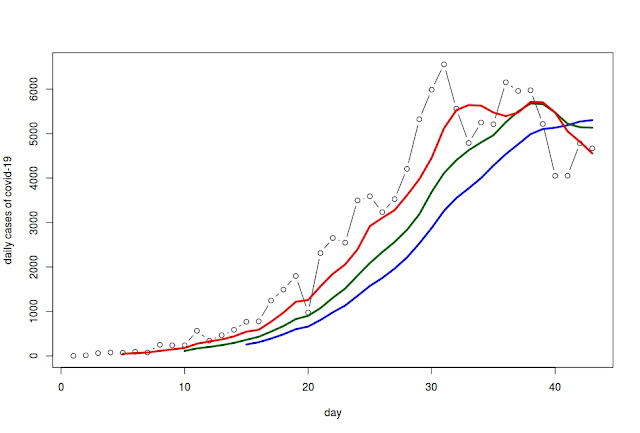
New daily cases of Covid-19, i.e. new daily recorded cases of the disease. The moving average taken over the last 5 days (in red) crosses the moving average over the last 10 days (green). Both, in turn, cross the moving average over the last 15 days (blue) from above. These curve intersections give us some cautious optimism.  
------------------------------
When dealing with time series, moving average analyses can be useful in revealing possible trend changes. Moving averages can – although somewhat simplistically – approximate trends over several time horizons (short, medium, long period) using different lags (measured in days over which the moving average is calculated). For example, a short-term moving average (calculated over the last 5 days) that crosses a long-term moving average (calculated over the last 15 days) from above may be a sign that the until-then increasing trend has now shifted. Caution though. Moving average analyses are generally a tool to confirm results obtained with more sophisticated methods and models.


Buoni, timidi segnali

Nuovi casi giornalieri di #covid19: media mobile sui precedenti 5gg (rosso) che incrocia a scendere la media mobile sui precedenti 10gg (verde) che incrocia a scendere la media mobile sui precedenti 15gg (blue), questi incroci in discesa indicherebbero un cauto segnale di speranza [StatGroup-19]
---
In serie di dati ordinati sul tempo, l'analisi di medie mobile può essere utile per rilevare i potenziali cambiamenti di tendenza. Anche se in modo molto semplice, le medie mobile possono approssimare i vari livelli di trend (breve, medio, lungo periodo) utilizzando ritardi diversi (in termini di giorni su cui la media mobile è calcolata). Ad esempio una media mobile con ritardo breve (calcolata sui precedenti 5gg) che incrocia in discesa una media mobile con ritardo più lungo (calcolata sui precedenti 15gg) potrebbe indicare che una tendenza fino a quel momento crescente ha cambiato direzione. In genere l'analisi di medie mobili si usa solo per confermare in modo semplice analisi effettuate con metodi o modelli più sofisticati.